Title Properties
Using this property user can change look and feel of widget title.
Title Properties: This video contains information about How to add and format widget title properties in OPNBI.
Title Properties setting contains following options.
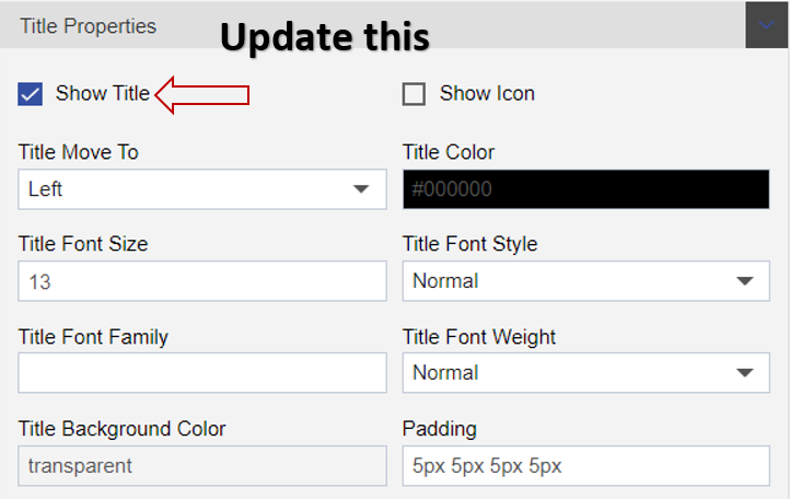
Show Title
By default this checkbox is marked. Uncheck this checkbox in order to hide title form widget
Show icon
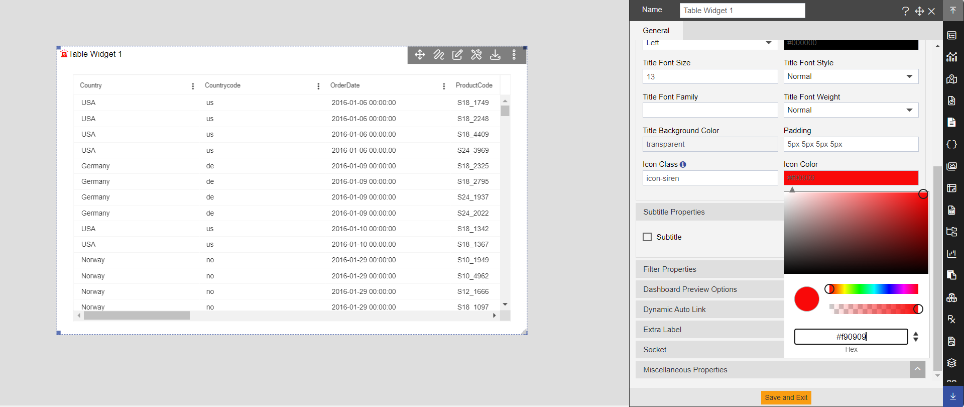
This option is used to add icon before chart title. When clicking user will see siren icon before chart title. Refer below screenshot.
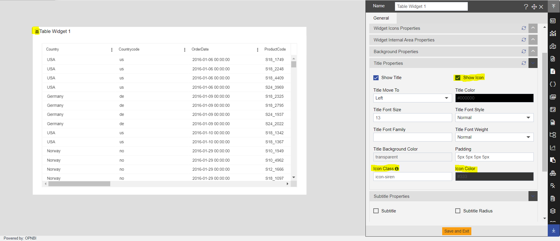
Also, there are 2 new settings displayed as you click on this show icon checkbox which are:
Icon class and Icon color
In Icon class text box, the default icon is saved as icon-siren and due to which you will see siren icon before title of the table. To have the list of icon classes supported, there is an information icon available just on the right side of icon class label. When you hover on this icon; you will see the list of supported icon classes which you can use.
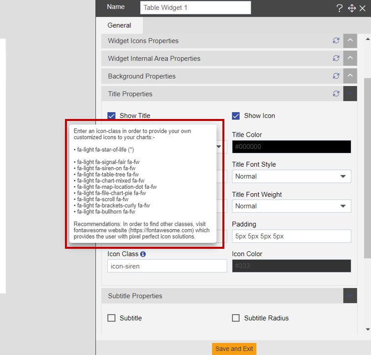
- You can change color of icon from ‘Icon color’ setting.
Title Move To
With this setting user can change the title position.
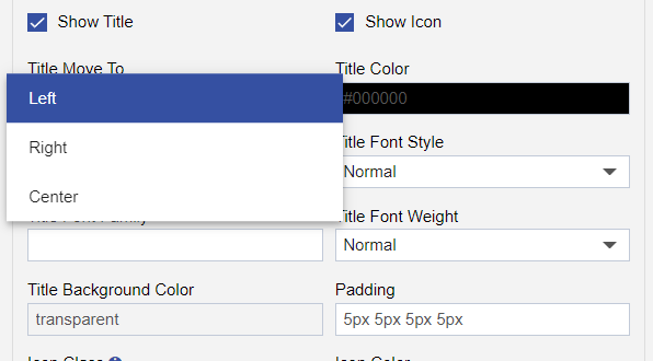
- There are 3 options available for the title position Left, Right and Center. By selecting required option user can change position of title.
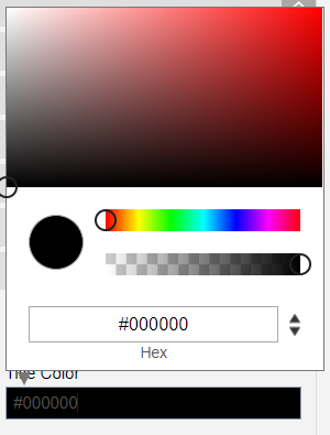
Title color
With this setting, user can change color of widget title. To change color, just click on color pallet of Title color setting and from variety of color options you can select any color for widget title.
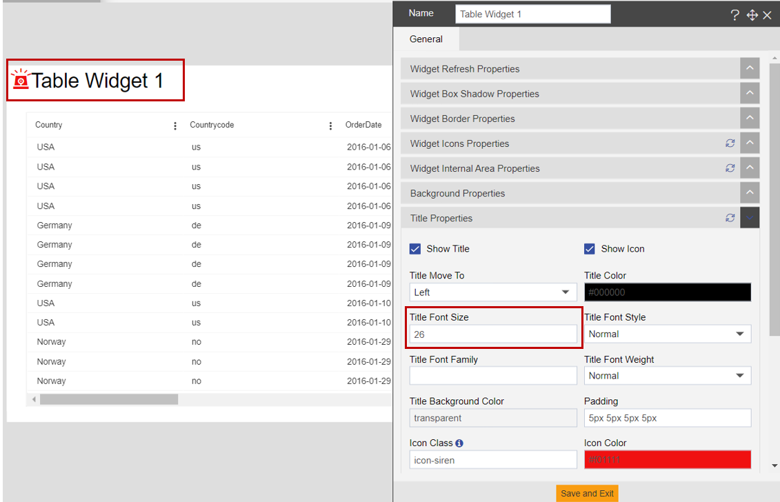
Title Font Size
With this setting user can increase and decrease the size of the widget title.
Title Font Style
With this setting, user can change the title font style from the available list of font styles.
Title Font Family
With this setting user can change the font of the title from available list of fonts.
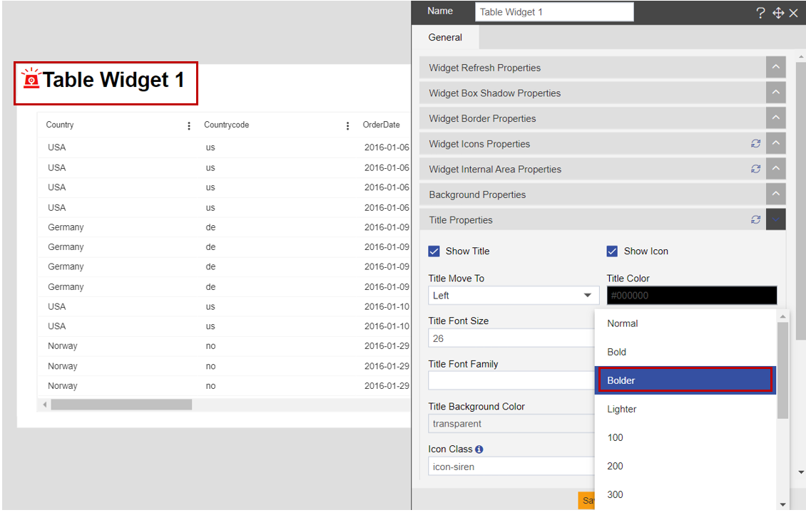
Title font weight
With this setting user can apply font weight. For example, bold, bolder, lighter and many available from the drop-down menu.
Title background color
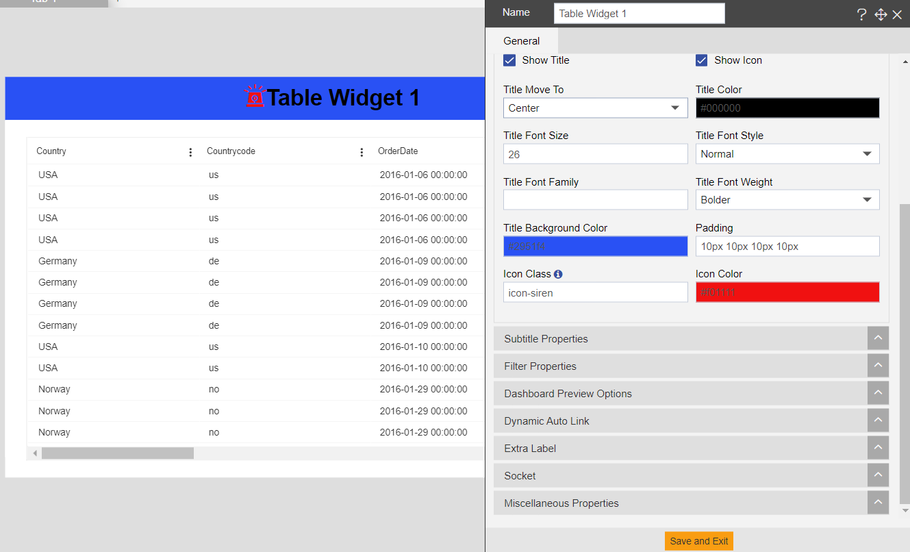
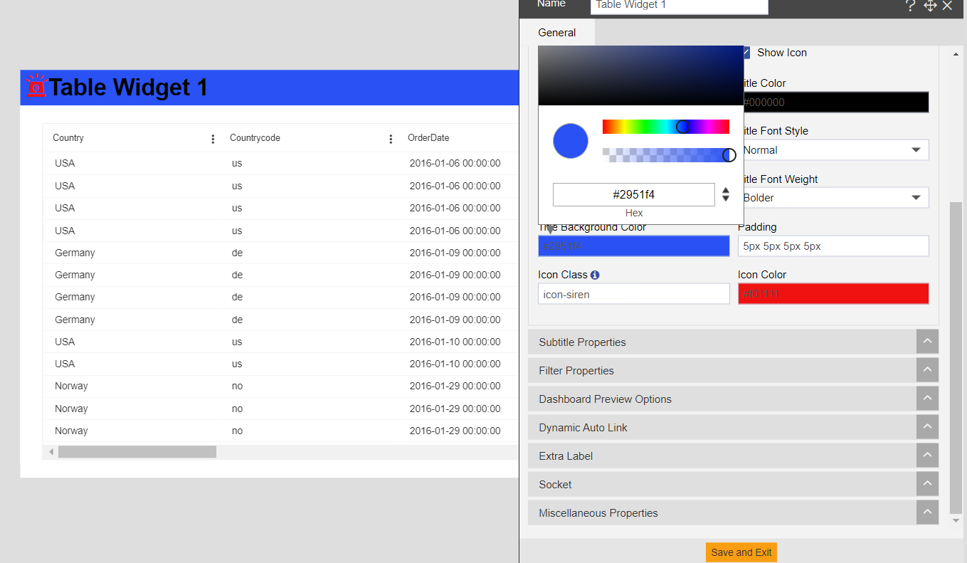
With this setting we can set background color of the widget title. To change title background color, click on the color palette and select any required color. See image below,
Padding
This setting is used to provide padding to the widget title. User can provide padding in Top-Right-Bottom-Left respectively in pixels. For example, applying padding ‘10px, 10px, 10px, 10px’ means applied padding of 10 pixels in Top-Right-Bottom-Left side of the table widget.
